First Impressions Are Emotional
Before anyone reads a single word, design has already spoken. Color, layout, and typography trigger emotional reactions almost instantly. We may think we are logical decision-makers, but our brains decide how we feel about a brand long before we analyze what it says.
When something looks familiar and well considered, it feels safe. When it feels chaotic or inconsistent, trust drops. This happens in seconds. As a marketer, I have learned that good design is not just about beauty. It is about reassurance.
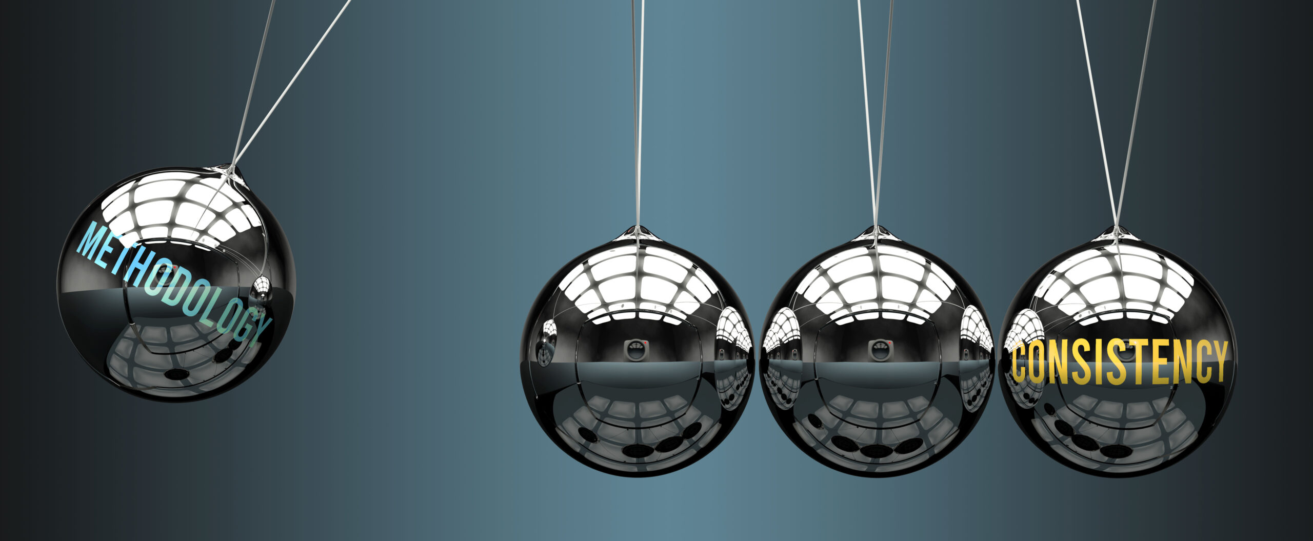
Why Consistency Feels Trustworthy
Consistency tells people that a brand knows who it is. When visuals stay aligned across platforms, it creates a sense of reliability. People feel like they know what to expect, and that predictability builds comfort.
Imagine visiting a brand’s website and then its social media. If the colors, tone, and layout feel connected, the experience flows naturally. If everything looks different, something feels off. That disconnect creates doubt, even if the product itself is great.
Consistency does not mean everything has to look the same. It means everything feels related. That feeling is what creates credibility over time.
The Psychology of Color
Color is one of the strongest emotional tools in branding. It sets the mood before any message is delivered. Soft neutrals can feel calm and thoughtful. Bold colors can feel energetic and confident. Muted palettes often feel refined and intentional.
What matters most is not choosing trendy colors but choosing colors that align with the brand’s values. A wellness brand might lean into calming tones that reduce stress. A tech company might use cooler shades to signal innovation and clarity.
When colors change randomly or without purpose, it creates confusion. When they stay consistent, they reinforce identity. Over time, people start associating those colors with the feelings the brand creates. That association builds loyalty.
Typography Is a Voice
Typography is often overlooked, but it plays a huge role in trust. Fonts have personalities just like people. Some feel formal. Some feel friendly. Some feel modern or traditional.
When typography is inconsistent or hard to read, it creates friction. People may not consciously notice why they feel uncomfortable, but they feel it. Clear, readable typography shows care. It says the brand respects the reader’s time and experience.
I always encourage teams to choose typefaces that match their tone and use them consistently. Headlines, body text, and buttons should work together. When typography feels cohesive, communication feels easier and more honest.
Layout Guides the Experience
Layout is about how information is organized. A thoughtful layout helps people move through content without effort. It guides attention and creates rhythm.
When layouts are cluttered, people feel overwhelmed. When spacing is intentional, people feel calm. White space is not empty space. It is breathing room. It allows ideas to land.
Consistent layouts also build familiarity. When people know where to look for information, they feel in control. That sense of control builds trust. Over time, these small positive experiences add up.
Visual Consistency Across Platforms
Today, brands live everywhere at once. Websites, social media, emails, ads, and packaging all tell pieces of the same story. If those pieces do not align visually, the story feels fragmented.
Visual consistency across platforms helps create a unified identity. When someone recognizes a brand instantly, even without seeing the logo, that recognition signals credibility. It shows the brand has invested in clarity and intention.
I have seen brands dramatically improve trust simply by tightening their visual systems. Once colors, fonts, and layouts were aligned, engagement increased. People stayed longer and interacted more. The brand felt more established without changing its message at all.
Trust Is Built Through Repetition
Trust does not come from one beautiful design. It comes from repeated positive interactions. Each time someone sees a familiar color, a consistent layout, or a recognizable style, their confidence grows.
These visual cues work quietly in the background. They remind people that this brand has shown up before and delivered a good experience. Over time, that familiarity reduces hesitation.
This is why consistency matters more than perfection. A simple, clear design used consistently will outperform a stunning design that constantly changes.
Design Reflects Values
Design choices communicate values whether we intend them to or not. Sloppy design can suggest carelessness. Overly aggressive design can feel pushy. Thoughtful design signals respect.
Brands that design for trust think about the emotional impact of every choice. They ask how this makes someone feel, not just how it looks. They design with empathy.
When values are reflected visually, people sense alignment. That alignment makes it easier to believe in the brand and stay loyal to it.
Long-Term Loyalty Comes From Feeling Seen
At its core, trust is about feeling understood. Visual consistency helps create that feeling. It reduces uncertainty and builds familiarity. It tells people that a brand is stable, thoughtful, and reliable.
Designing for trust means choosing clarity over complexity and intention over trends. It means respecting the audience enough to create experiences that feel calm, cohesive, and human.
In a world full of visual noise, consistency stands out quietly. And that quiet confidence is what keeps people coming back.